Hello my dear readers,
it’s been a while, a lot has happened but here we are again.
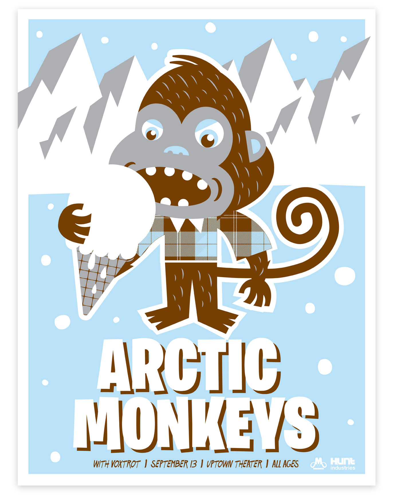
Today I present you Arnus!
A creative man with a lot of humor and fantasy!
I’ve waited a long time to have his answers to my questions, but believe me, they are worth waiting for! Enjoy and let you inspire by this genius man, Arnus!
Q – Tell us a little about yourself.
A – Oh hello ! Sorry i’m late, I come from the garbage container. I’m arnus, I’m french, I am romantic, I love music and I do enchanting drawings. I live since three years in the south of France where people always want to go to the river,… I think that they become fishes when they grow old.
My parents gave me a good education. When I was 5 I saw Pope John Paul II his face on a bank-bill appear on the wall of my sisters bedroom. I studied multimedia and learned how to badly make websites and CD-ROMs in Saint-Dié des Vosges, incredible town, did you know they have a restaurant called the “Mac Mils”?
After that I
kkkkkkkkkkkkkkkkkkkkkkkkkkkkkkkkµµµµµµµµµµàç_çççççççççççççççç______________ (sorry i’m keeping the young cat of a friend)
So after that I decided to draw!
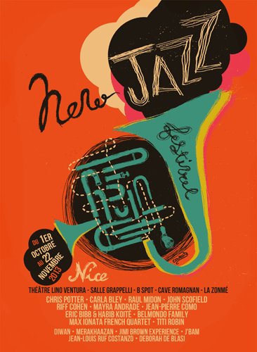
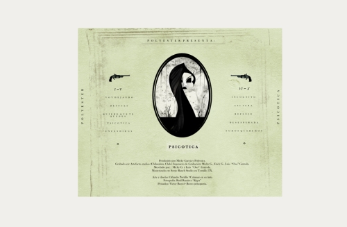
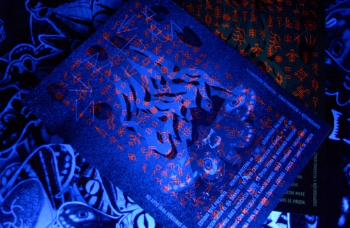
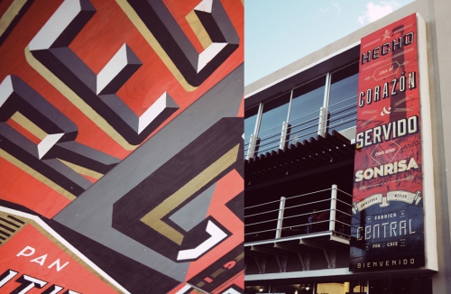
New Jazz festival 2013 – Affiche by Arnus
Q – Where do you get your inspiration for your designs?
A – I build my illustrations like a hunter places his traps. Drawings are sometimes like cold vengeance; built slowly and perversely. My hands are guided by voices which are often oppressive and directive. If you could hear what they tell me I think you’ll understand me that they’re trying to drive me mad!!
Those voices come from my girlfriend’s mouth. But now it’s quiet, i’m single today. But what can I do with serenity and concentration?
Couple life and its misunderstandings and frustrations are so perfect for inspiration.
Misunderstandings and misinterpretations of all kinds are good too you know, for example, if you’re taking a walk in the forest and sunddenly you stop walking because you see a beautiful deer standing in front of you and as you quietly come nearer, you realise that the deer was only a bench…
My works are visual misinterpretations.
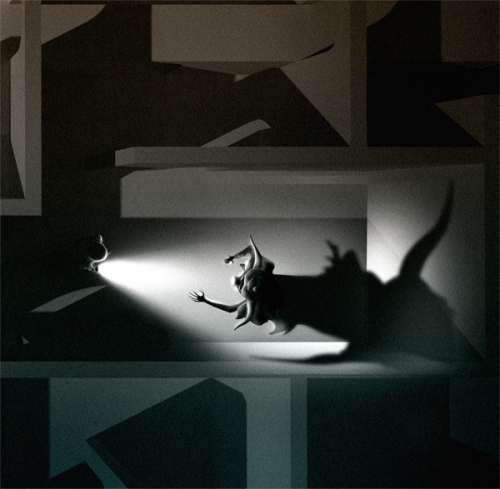
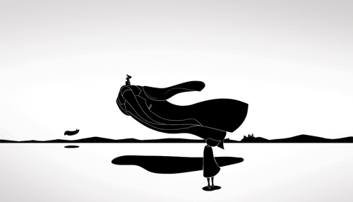
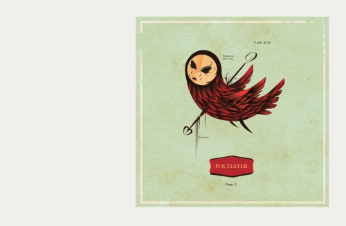
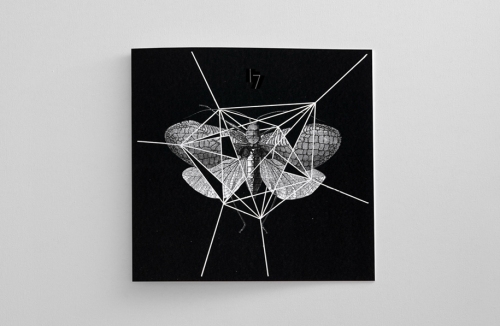
Venise by Arnus
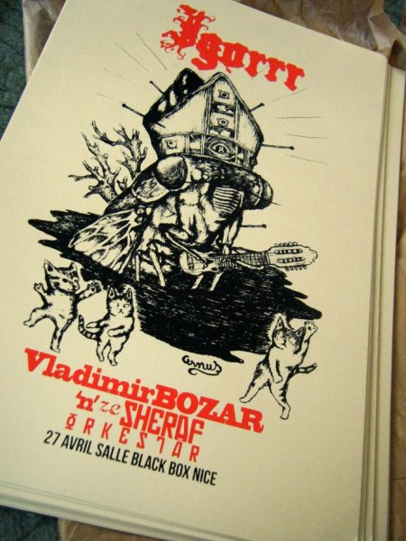
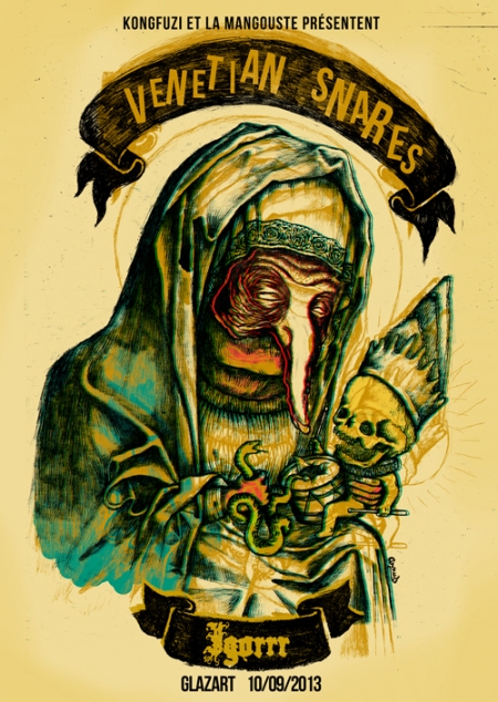
Q – I see you create posters for Igorrr and Venetian Snares: do you create the posters on the music they make to feel the music and bring it over in the poster?
A – In fact, the day I did the poster for them, I think there were public works outside, the noise was horrible! All the day the noise of trucks, cement mixer, pneumatic drills and men shouting too loud broke my head!
Fortunately, all this noise stopped when I ejected Igorrr’s CD.
But making a poster for Igorrr is easy because as a child I went to the bible study every thursday to talk about God, I think Igorrr also did this. And.. do you know Jo Akepsimas the religious bluesman ? He has very good hits, I think Igorrr takes his inspiration a lot from him, they exactly do the same music in another way.
I always listen to the music for which I make the poster. I found the track that inspires me the most and then i listen it in a loop all the time I draw.
For Igorrr this time I listened to “Pizza aux narines” a lot, and “Tout petit Moineau” of course.
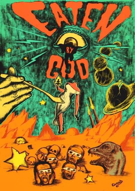
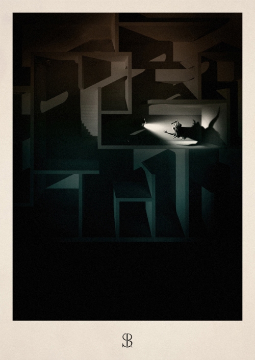
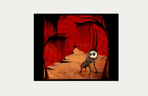
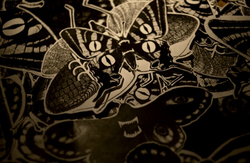
Eaten by Arnus
Q – Are the illustrations self-created?
A – You mean if I use the work of other people and say it’s mine, like DJs do?
I like collages, but I’m not comfortable with the fact of using other people’s work or face, or hands, or teeth, or…
But yes, to make a drawing, I look at a lot of old photographs that I beat, break, smash and mix to make them show me the story that I want to tell. My illustrations are a mix of real facts, jokes, old pictures, family pets, personal stories and other references…
Sometimes a part of the drawing comes from different ‘real’ pictures, sometimes it’s only details, but it ALWAYS tells a (hidden) story.
But I don’t care if people don’t get it.
For example, a few days ago, a girl almost insulted me because she thought one of my drawing was dealing with seals massacre, when it was only showing a girl ridding an (badly drawn) otter!
The people of today are crazy! They have a so big need to hate that they see horror where there is only love.
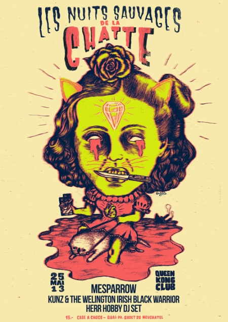
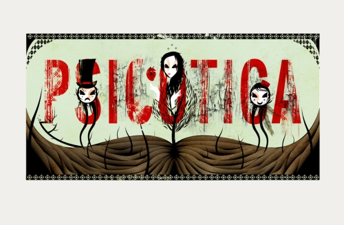
Chatte by Arnus
Q – Which designers and creative minds were your biggest inspirations growing up?
A – Building your brain with 80’s television is not easy, between Carambar’s advertisement and Roland Topor’s Telechat, I’m still not sure to understand in which kind of world I live.
But I’m a big music fan, so a lot of them inspired me. When I was young, I bought cassettes only for the artwork of the cover and was often disappointed by the music itself.
Also horror movie posters designs marked me, I remember being intrigated by the “Bad Taste” vhs cover everytime I went to the videoclub or the ridiculous one called “Meurtres au crayon” showing a woman with a pencil in her nose but I never saw the movie.
If you prefer a list, I realy like Dürer, Pushead, Kurt Cobain’s painting for “Incesticide”, german expressionism movies, Gotainer, religious art, the Twilight Zone too.
I wish I could live in a Twilight Zone episode ; “A Stop at Willoughby” for example.
And I love the 60’s Brigitte Bardot, you know her song “On déménage” ?
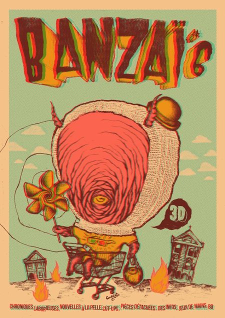
Banzai by Arnus
Q – Who is your dream client?
A – It would have been Mike Patton ten years ago with Fantomas. Or Sleepytime Gorilla Museum but it’s too late too. It could be René Grolier, it’s a french accordion champion who sings a song about the “Coucougnettes” i think you can like. Johnny Hallyday only for the challenge (and the money).
But every band who makes good music and let me draw what I want is a dream client.
I’d like to make posters for movies or circuses too.
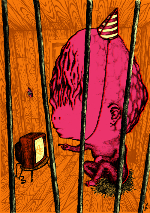
Tele Banane by Arnus
Q – Where do you see yourself in the future?
A – In a Berlingo I think (you know, it’s a Renault french car) even if in the future we don’t need roads.
Thank you so much for this awesome interview Arnus!
Check out all his works !!
Website: http://ohlalaa.free.fr
Flickr: http://www.flickr.com/photos/arnushorrib…
Behance: http://www.behance.net/arnus
Facebook: http://www.facebook.com/pages/Arnus/1729…
Blogspot: http://arnushorribilis.blogspot.com
Other: http://glaucom.free.fr

Stay up to date with the sneakydesign facebookpage.


![colo[r]evolution Fabric Dye](https://sneakydesign.files.wordpress.com/2013/09/color-rev-01.jpg?w=500&h=375)